– Street-Ready Pastels: How to Make Soft Colors Look Bold This Spring
So, What’s the Deal with Pastels Anyway? Aren’t They Just… Cute?
Honestly, when you hear “pastels,” what’s the first thing that pops into your head? Baby showers? Easter baskets? Maybe a fluffy cardigan your grandma knitted? For a long time, pastels have had this reputation—sweet, gentle, almost apologetic. They’re the polite wallflowers of the color spectrum, aren’t they? Think blush pinks, sky blues, mint greens, and buttercup yellows. They’re lovely, sure, but “bold”? That’s probably not the adjective that immediately springs to mind. And that’s precisely where we’re going to shake things up this spring, because those soft, soothing shades? They’ve got a secret weapon, and with the right styling, they can absolutely command attention on the street. It’s all about flipping the script, you know? Taking what’s traditionally perceived as subtle and giving it an unexpected edge. It’s kinda like when a quiet person suddenly drops a mic-drop comment – totally unexpected, completely impactful.
From “Oh, How Sweet” to “Whoa, Look at That!” – The Pastel Power-Up
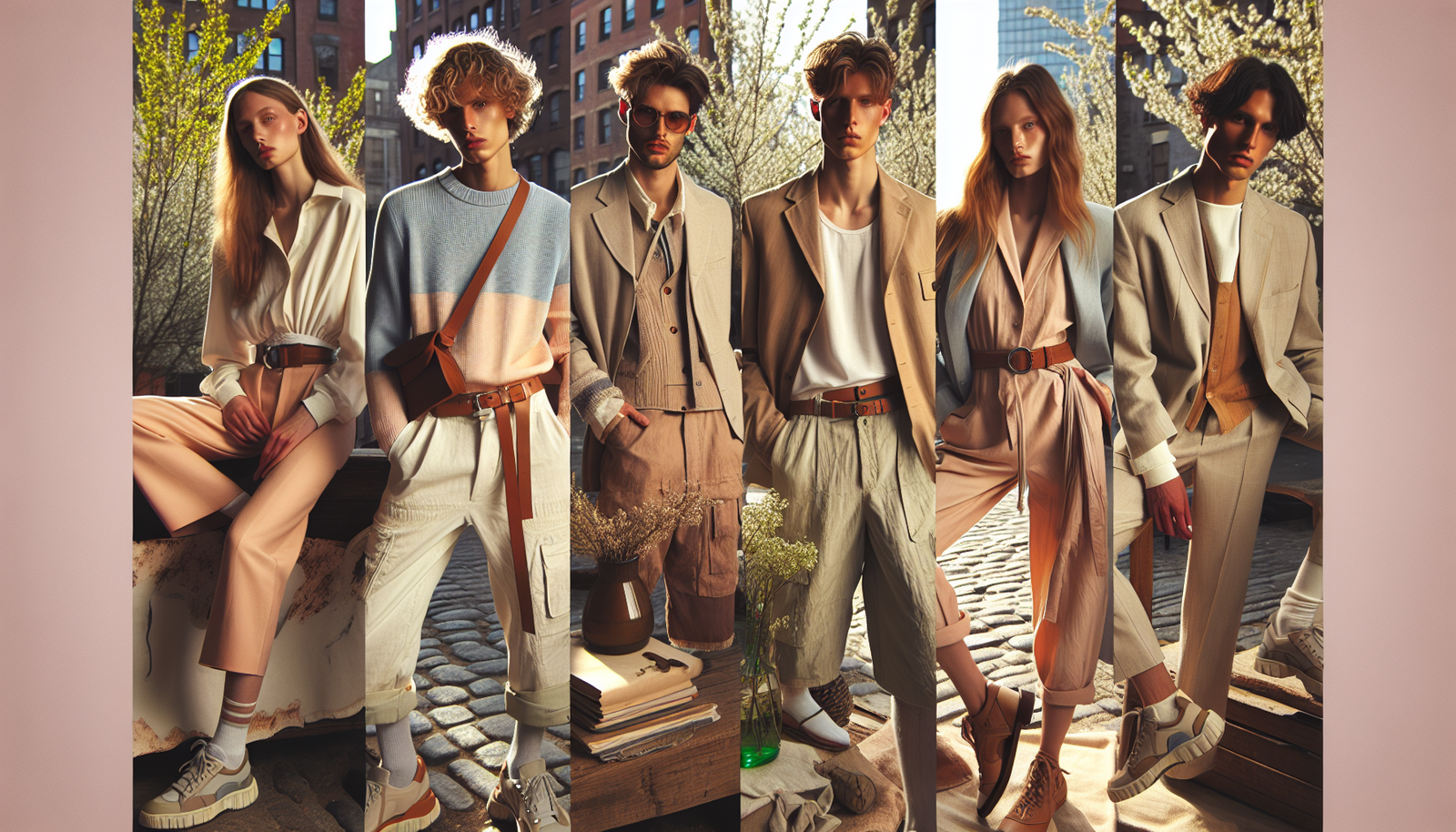
Here’s the thing: pastels, in their very nature, are muted. Their saturation is low, their brightness often high. This inherent softness can be a Trojan horse for style, honestly. Instead of fighting that gentleness, we’re going to lean into it, but with a deliberate, assertive twist. We’re not talking about just wearing a pastel sweater; we’re talking about crafting a look that says, “Yes, these are soft colors, but I mean business.” Picture this: a buttery yellow a-line skirt paired with a chunky, almost industrial-looking belt, or a lavender blazer thrown over a graphic tee and distressed jeans. It’s about contrast, juxtaposition, and a dash of unexpected flair. We’re moving beyond the delicate and stepping into the dynamic.
You know, fashion is often about breaking norms, isn’t it? It’s about taking something conventional and spinning it on its head. This spring, pastels are our playground for exactly that kind of creative rebellion. And honestly, it feels fresh after so many seasons of embracing earth tones or bright, in-your-face neons. There’s a certain chic sophistication to making soft colors feel powerful; it’s a confident whisper rather than a shout.
The Secret Sauce: Playing with Textures – Not Just Any Fabric, But *That* Fabric
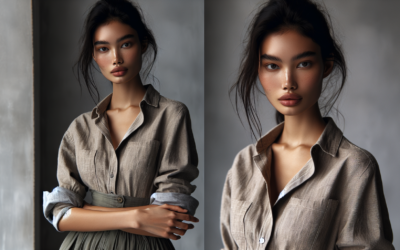
Let me explain: when you’re working with subtle colors, texture becomes your best friend. It gives those soft hues a tactile dimension, a visual interest that prevents them from fading into the background. Think beyond your basic cotton tee. Imagine a blush pink in a rich satin; it catches the light in a way that’s completely different from a matte cotton. Or a mint green corduroy jacket – the ridges and valleys create shadows and highlights, making the color appear deeper and more complex.
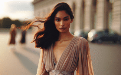
- Satin and Silk: These ultra-smooth, reflective fabrics make pastels feel luxurious and even a bit daring. A pastel silk slip dress under a tough leather jacket? Chef’s kiss.
- Leather and Faux Leather: A pastel leather jacket or trousers? Now you’re talking bold. The inherent edge of leather immediately elevates any soft shade, giving it a cool, urban vibe.
- Knitwear (Chunky is Key): A thick, chunky knit sweater in a pastel hue adds volume and a cozy, yet substantial feel. It’s comforting but also makes a statement with its presence.
- Corduroy and Velvet: These textured materials absorb and reflect light uniquely, adding a rich depth to pastels that flat fabrics simply can’t. A pastel velvet blouse can be incredibly opulent.
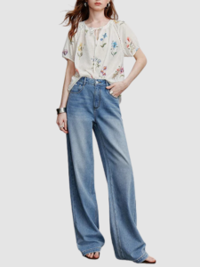
- Denim: Don’t underestimate pastel denim! A pair of wide-leg, light blue jeans or a faded pink denim jacket offers both structure and a casual coolness.
Mixing these textures is where the real magic happens. A pastel tweed blazer over a silk camisole, or a pastel leather skirt with a chunky knit sweater. See what I mean? Each texture brings its own personality to the party, and when they mingle with those gentle colors, they create a dynamic ensemble that’s anything but meek. It’s like having a conversation where everyone’s contributing something slightly different, but it all just harmonizes beautifully.
Layer Up, Buttercup! Building Depth with Pastel Stacks
Layering isn’t just for warmth, folks; it’s a styling superpower, especially with pastels. When you layer different pastel shades, or even varying tones of the *same* pastel, you create a visual story that has depth and intrigue. It’s like painting with clothes, honestly. Instead of a flat canvas, you’re building a three-dimensional masterpiece.
Think about it: a light lavender camisole peeking out from under a slightly darker lilac blazer. Or a mint green slip skirt with an oversized, pale pistachio knit sweater. This isn’t about perfectly matching; it’s about harmonious variation. You can even mix different pastel families – a pale yellow shirt under a baby blue denim jacket. The key is to keep the overall saturation similar so they play nicely together rather than clashing. This technique also helps to transition pastels from ethereal to substantial; the sheer volume of fabric, even if it’s light, adds significant presence. It’s like stacking pancakes – one pancake is good, but a stack? That’s a feast!
And don’t be afraid to throw in a neutral base layer or an accent to ground the look. A crisp white t-shirt under a pastel suit, for instance, provides a clean canvas. Or a pair of classic black boots to add a touch of toughness to an otherwise soft outfit. These grounding elements are like the anchor of a ship; they keep everything steady and intentional.
Breaking Bad (and Beige): Contrasting with Darker Hues – The Unexpected Twist
Here’s where we really inject some serious oomph. While layering pastels with pastels is lovely, *contrasting* them with deeper, richer, or even stark darker tones is what makes them truly pop. This is the fashion equivalent of putting a diamond on a black velvet cushion – suddenly, the delicate gem just shines with incredible intensity.
- Black is Back (Baby!): A pastel top with black leather pants? A baby blue dress with chunky black combat boots? This isn’t just about color contrast; it’s a statement about juxtaposing softness with strength, making the pastel feel rebellious and chic.
- Navies and Charcoal Greys: If black feels too harsh, deep blues and greys offer a sophisticated alternative. A pastel pink blouse under a sharp navy blazer, for instance, looks incredibly polished yet modern.
- Deep Greens and Burgundies: For a more earthy, nuanced contrast, rich forest greens or burgundy can make pastels feel grounding and luxurious. Imagine a mint green shirt with a deep burgundy skirt – unexpected, right? And utterly stylish.
- Metals (Especially Black or Gunmetal): Think about hardware – buckles, zippers, jewelry. Black or gunmetal finishes on accessories can instantly toughen up a pastel ensemble.
This contrast does something really interesting to our perception. The pastel suddenly doesn’t look timid; it looks deliberate, almost defiant, existing in conversation with its bolder counterpart. It’s a psychological trick, really, making the soft color feel more vibrant by surrounding it with something equally strong, just in a different way. It’s similar to how a compelling speaker uses pauses – the silence makes the subsequent words carry more weight.
Accessorize Like a Boss: The Hardware and Sparkle Factor
Accessories are the punctuation marks of an outfit, and with pastels, they can seriously crank up the volume. We’re not talking dainty, barely-there jewelry here. We’re thinking bold, substantial pieces that scream “I’m here!” without overshadowing the delightful colors.
Chunky gold chains, for instance, draped over a pastel knit immediately add a street-style edge. Or a sculptural silver cuff bracelet with a sky-blue dress. The metallic gleam provides a stark, attention-grabbing counterpoint to the pastel’s softness. And don’t forget industrial elements – heavy-duty belts with oversized buckles, backpacks with utilitarian hardware, or even shoes with visible zippers and studs. These elements introduce a sense of ruggedness that grounds the lighthearted nature of pastels. This is where you can really let your personal style shine through, adding those little touches that make the outfit uniquely *you*. It’s those little details that pull an entire look together, connecting what might otherwise feel like disparate elements into a cohesive, intentional statement.
And shoes! Oh, the shoes have so much power here. Instead of delicate sandals, consider chunky sneakers, combat boots, or even a sleek, squared-toe ankle boot. They give the pastel ensemble a grounded, urban appeal. I mean,
Doc Martens with a floaty pastel dress? That, my friends, is a look. It screams confidence, a kind of effortless cool that says, “I know what I’m doing.”
Prints, Patterns, and Visual Interest – Beyond the Solid Swatch
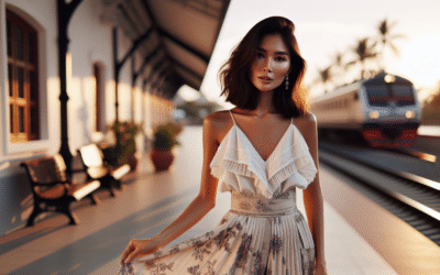
Who said pastels have to be solid? Introducing prints and patterns into your pastel repertoire is a fantastic way to add complexity and visual interest. A pastel floral print can feel utterly charming, but if that print is on, say, a structured blazer, or paired with a tough pair of trousers, it suddenly gets an unexpected edge.
Think about geometric patterns in pastel shades – checks, stripes, or even abstract swirls. These patterns inherently add a dynamic quality that a single-color garment might lack. They provide movement for the eye, making the soft colors feel more active rather than passive. A gingham dress in pale blue and white suddenly feels much more playful and substantial than a plain blue one. It’s like adding spices to a dish – the base ingredients are there, but the spices bring it to life. This also allows for a bit of cheeky nostalgia, doesn’t it? Bringing back patterns that might have been popular in different eras and reimagining them in a modern context.
You can also play with color blocking pastels with other pastels, or pastels with neutrals. Imagine a skirt that’s half lavender, half pale yellow. The deliberate lines and distinct color fields give it a bold, architectural feel. The key here is not to shy away from design elements that break up the monotony and demand attention.
The Attitude Adjustment: It’s All About How You Carry It, Darling
Honestly, the clothes are only half the battle. The biggest secret to making pastels look bold? Your overall attitude. Seriously. Are you slouching, or are you walking with purpose? Is your head held high? When you wear something with confidence, it instantly elevates the entire appearance, regardless of color. It’s an internal thing that manifests externally, you know?
Think about the way designers present their collections on the runway – even the softest, most delicate pieces are worn with an air of undeniable assertion. That’s the vibe we’re going for. Picture a pastel suit! A structured, well-tailored suit in a sorbet shade can look incredibly powerful. It challenges traditional notions of professional attire and signals a modern, self-assured approach. It says, “I’m confident enough to wear something unexpected, and I own it.” This psychological aspect is sometimes overlooked, but it’s absolutely fundamental. A person with charisma can make a plain t-shirt look like couture.
So, stand tall, walk with a stride, and own those soft hues. When you project confidence, the colors themselves seem to absorb that energy, transforming from gentle whispers into powerful statements. It’s your personal brand shining through.
Spring Fling Street Style Inspo: Real-World Applications You Can Steal!
Alright, enough theory! Let’s get down to some concrete ideas you can totally try out this spring. These are just jumping-off points, of course – feel free to mix and match and make them your own!
- The “Boss Babe” Pastel Suit with an Edge:
Grab a tailored pastel suit – maybe a soft mint green or a powder blue. Instead of pairing it with a silk blouse, throw on a vintage band tee or a simple, fitted black turtleneck. Accessorize with chunky gold jewelry, a structured mini-bag, and some sleek, pointed-toe ankle boots. This look screams “I’m powerful, but I also know how to have fun.” The contrast of the formal suit with casual elements and tough accessories makes the pastel feel incredibly deliberate.
- Floaty Dress, Chunky Boots: The “Sweet but Fierce” Combo:
Pick a flowy, perhaps even floral, pastel dress – think lavender, pale yellow, or blush. Now, ditch the dainty sandals and stomp into a pair of black Doc Martens or chunky platform boots. Add a structured crossbody bag or a denim jacket draped over your shoulders. This look is all about that beautiful tension between feminine softness and undeniable grit. It says, “I can be pretty, but don’t mistake that for weakness.”
- Pastel Leather/Faux Leather: The Unexpected Rebel:
Remember what we said about texture? Imagine a pair of beautifully cut faux leather trousers in a soft buttercup yellow or a powder blue. Pair them with a simple white ribbed tank top and an oversized denim jacket. For shoes, go with casual white sneakers for an urban feel or heeled mules for a dressier vibe. The unexpected material in a soft color creates a bold, fashion-forward statement that’s hard to ignore.
- Monochromatic Pastel Magic with Industrial Touches:
Choose one pastel color – let’s say a pale peach. Wear a monochromatic outfit: a peach knit sweater, matching peach wide-leg trousers, and maybe a peach coat. Now, break it up with heavy-duty accessories. Think a thick, metal-buckled belt over the sweater, a large metallic bag, and chunky silver earrings. The continuous wash of pastel is amplified by the sheer volume of it, and the industrial accents give it a substantial, edgy grounding.
- The “Pop of Pastel” Utility Look:
Lean into a utility or workwear-inspired outfit: cargo pants, an oversized blazer, or a jumpsuit, all in neutral tones like beige, olive green, or black. Then, add a strong pop of pastel. This could be a vibrant pastel statement bag (like a lime green or hot pink), a pair of bold pastel sneakers, or even a pastel baseball cap. The pastel becomes the focal point, a surprise splash of color in an otherwise grounded, functional ensemble. Like finding a beautiful wildflower growing through cracks in the pavement, you know?
Frequently Asked Questions About Rocking Bold Pastels
Can I wear pastels to a formal event and still look bold?
Absolutely! For formal events, consider a structured pastel suit or a sleek midi dress in a luxurious fabric like silk or satin. Pair with metallic accessories (think gold or silver), sharp heels, and perhaps a deep red or berry lip for an added touch of drama. The key is in the tailoring and high-quality materials.
What are the best pastel shades for my skin tone?
Generally, cooler pastels (like mint, sky blue, lavender) tend to flatter cooler skin tones, while warmer pastels (peach, buttercup yellow) complement warmer skin tones. However, don’t feel restricted! The best way to know is to try it on. Sometimes a contrasting pastel can make your skin glow even more.
How do I make a single pastel item stand out?
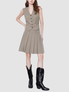
Focus on its texture or structure. A pastel leather jacket, a chunky knit sweater, or a pleated skirt in a pastel shade will naturally draw attention. Pair it with all neutrals (black, white, grey, denim) so the pastel becomes the star of the show. And remember, attitude is everything!
Can men wear bold pastels?
Of course! Men can absolutely rock bold pastels. Think a pale pink linen button-down with dark wash jeans, a mint green crewneck sweater with chinos, or even a pastel blazer over a crisp white tee. Pairing them with rugged textures or darker neutrals often achieves that bold, confident look.
What accessories should I avoid when trying to make pastels look bold?
Generally, avoid overly dainty or matching accessories that reinforce the “sweet” perception of pastels. Ditch the tiny floral earrings or delicate pearl necklaces if your goal is bold. Instead, lean into chunky, substantial, or contrasting pieces as discussed earlier.
How can I incorporate pastel makeup into a bold pastel outfit?
You can either match a pastel eyeshadow to your outfit for a monochromatic, high-fashion look, or use a contrasting pastel as a pop. For true boldness, consider a sharp graphic eyeliner in a pastel shade, or pair a soft pastel outfit with a strong, deep lip color (like plum or deep red) to add an unexpected edge.
DISCLAIMER
The fashion advice and styling suggestions provided in this article are for general informational purposes only and are based on current trends and common styling practices. Individual results may vary based on personal style, body type, and garment availability. While we strive to offer helpful and creative ideas, always prioritize your comfort and personal expression when choosing your outfits. We are not responsible for any fashion emergencies or wardrobe malfunctions that may occur from following our suggestions (though we highly doubt they would!).
document.addEventListener(‘DOMContentLoaded’, function() {
const faqQuestions = document.querySelectorAll(‘.faq-question’);
faqQuestions.forEach(question => {
question.addEventListener(‘click’, function() {
const answer = this.nextElementSibling;
if (answer.style.display === ‘block’) {
answer.style.display = ‘none’;
} else {
answer.style.display = ‘block’;
}
});
});
});
Categories
- Activewear (160)
- Athletic Jackets (12)
- Comfortable Leggings (14)
- Cozy Joggers (15)
- Functional Sports Shorts (20)
- Stylish Tank Tops (20)
- Supportive Sports Bras (20)
- Yoga Pants (20)
- Yoga Tops (18)
- Bottoms (43)
- Classic Capris (4)
- Comfortable Leggings (4)
- Fashion Shorts (3)
- Skirts (12)
- Stylish Jeans (4)
- Stylish Overalls (4)
- Tailored Trousers (4)
- Unique Jumpsuits (4)
- Curved Fashion (73)
- Dresses (148)
- Boho Dresses (6)
- Casual Dresses (5)
- Cocktail Dresses (4)
- Evening Dresses (10)
- Floral Dresses (15)
- Little Black Dresses (6)
- Maxi Dresses (5)
- Midi Dresses (5)
- Plus-Size Dresses (5)
- Summer Dresses (5)
- Fashion Trends (82)
- Luxury & Designer (94)
- Outfit Inspiration (73)
- Style Guides (67)
- Sustainable Fashion (66)
- Swimwear (122)
- Chic Cover-Ups (6)
- Maternity Swimwear (4)
- One-Piece Swimsuits (5)
- Plus-Size Swimwear (3)
- Stylish Bikinis (7)
- Swim Dresses (6)
- Swim Skirts (7)
- Trendy Tankinis (6)
- Tops (61)
- Button-Down Shirts (4)
- Casual T-Shirts (10)
- Comfortable Hoodies (6)
- Cozy Sweaters (5)
- Elegant Tunics (8)
- Feminine Blouses (8)
- Off-Shoulder Tops (5)
- Stylish Tank Tops (4)
- Trendy Crop Tops (6)
- Travel & Lifestyle Fashion (67)
- Trend Reports (88)
- Workwear & Professional (72)