Why Mixing Prints Isn’t as Scary as You Think
You know what? For years, the mere thought of combining different patterns felt like walking through a minefield. A leopard print with stripes? No, thanks. Polka dots and florals? Pass. But honestly, mixing prints is less about chaos and more about creativity. It’s like seasoning your favorite dish — a little splash here, a pinch there, and suddenly, the whole thing pops. The magic happens when you break free from fashion rules and just have fun with it.
What’s fascinating is that print mixing has a surprising history. Back in the Victorian era, patterns were layered to show status and taste, often quite boldly. Flash forward to today, and it’s less about rigid hierarchy and more about personal flair. The good news: anyone can get the hang of it without a style degree.
Picture this. You stroll out wearing a striped blouse tucked into polka dot trousers and suddenly people start noticing — not in a “what is she wearing?” way, but the “wow, she’s nailed it” kind of vibe. That’s what mixing prints can do for you: earn nods, smiles, and maybe even spark conversations.
Start Small: The Friendly Way Into The Print Jungle
Sure, jumping straight into a head-to-toe print frenzy might thrill some fearless fashionistas, but for the rest of us, starting small feels safer — and smarter. Imagine pairing a leopard-print scarf with a simple striped tee. Boom! Interest without overwhelming your look.
Here’s the trick: anchor your outfits with one dominant color. Say your top and skirt have prints, but both pull from the same color palette — blues, for example. That shared color acts like glue, making the prints feel like a coordinated dance rather than a disjointed mess.
Think of it like a playlist. Sure, each song can be wildly different, but if they share a vibe or mood, the transitions feel smooth, right? Same deal with prints.
Also, when starting out, balance is your best friend. One bold, eye-catching print, paired with a more subtle one, can be just the thing to build your confidence. Don’t rush to mix florals with paisley right away — maybe try stripes with dots before jumping into larger patterns.
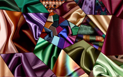
Print Size Matters — Let’s Talk Scale
Ever noticed how some print combos just seem… off? Like they’re speaking different languages? Often, it’s because of scale — the size of the prints. Mixing a giant floral pattern with tiny polka dots can either thrill or throw off the whole look, depending on how you handle it.
Here’s a tip: go for contrast in scale. Pair big, bold prints with smaller, calmer ones to create balance. It’s like pairing a heavy soundtrack with a quiet background hum — something to keep things interesting without overwhelming your senses.
For example, a dress with large abstract prints pairs beautifully with a small, delicate pinstripe shirt underneath or a clutch featuring tiny geometric patterns. Same world, different size — it works.
But don’t be afraid to experiment. Sometimes, matching two prints of similar scale can work if the colors complement each other and the patterns have different motifs. It’s a bit like pairing a jazzy saxophone solo with a mellow piano — unexpected but harmonious when done right.
Color Play: Your Secret Weapon for Pattern Pairing
When it comes to mixing prints, color is the unsung hero. It’s less about clashing and more about harmony — or sometimes, intentional disharmony that just clicks.
Here’s the thing: having at least one common color tying your prints together makes all the difference. If your leopard print has warm tones like browns and golds, pull those hues into your striped or floral pieces. It’s like they’re speaking a common language rather than trying to translate.
If you’re feeling adventurous but not reckless, why not bring in colors that complement rather than match? Think blue and orange, or purple and yellow — it’s a balance of contrast and cohesion that can add unexpected polish.
Seasonality also nudges your color choices. Spring and summer welcome bright, lively hues and light palettes, while fall and winter invite deeper, muted shades. So matching your print combos with the season can subtly boost your look — no need for a total wardrobe overhaul.
Print Families: Which Patterns Get Along Like Besties?
Mixing prints isn’t just about wild randomness. Believe it or not, some patterns have a natural affinity for each other — like peanut butter and jelly, or morning coffee and a good book. Knowing these “print families” can make the process feel less hit-or-miss.
– **Florals and Stripes:** This duo is a classic mixtape. The softness of floral contrasts perfectly with structured stripes, making it simultaneously feminine and edgy.
– **Polka Dots and Animal Prints:** Fun fact — both can share a playful energy. Polka dots, with their rhythmic spots, complement the wild irregularity of animal prints for an eye-catching combo.
– **Geometric and Abstract:** If your style leans modern and artsy, you’ll find these two patterns sync beautifully. Geometric shapes bring order; abstract prints add spontaneity.
– **Plaid and Floral:** This often nails a grunge-meets-boho vibe. Plaid brings structure, floral injects life and color — it’s cozy with oomph.
Here’s a little secret: sometimes patterns from different “families” can surprise you. Try a floral with an abstract swirl, or a subtle plaid with a loud polka dot. Just remember the color game and balance in scale!
Textures, Prints, and Layers: The Triple Threat
I can’t stress enough how mixing prints works best when you also play with textures and layers. Imagine a silky floral blouse under a chunky knit cardigan with a striped scarf thrown on top. Suddenly, your outfit isn’t just about the prints — it’s a full-on sensory experience.
Textures add depth, catching the light differently and preventing prints from looking flat or overwhelming. It’s like crafting a perfect playlist where different instruments come together rather than compete.
And layering? Oh, it’s a lifesaver. It lets you introduce multiple prints in stages instead of all at once — easing your eyes and those around you into the pattern party.
Think about how leather jackets, denim, or velvet pieces work with your prints too. They’re the unsung heroes that anchor your look and turn complexity into chic.
Accessories Aren’t Just Add-Ons — They’re Print Playmakers
Let me tell you, mixing prints doesn’t end with your clothes. Accessories hold a power that’s often underestimated. A spotted handbag or a scarf with a minuscule check can elevate—or rescue—an outfit.
Sometimes, starting print mixing here first is actually less daunting. You can mix a patterned belt with a printed bag and a solid outfit. It’s like dipping your toes in before the full swim.
Even shoes can join the fun. Leopard heels or polka-dot flats can punctuate an otherwise simple ensemble while still playing with patterns — growing your risk tolerance without a wardrobe meltdown.
Confidence Is Your Best Printed Outfit
Here’s the kicker: no amount of advice helps unless you wear your prints with confidence. Sure, everyone’s got an inner critic ready to point out the tiniest mismatch — but you? You’ve got the power to own what you wear.
People notice confidence way more than a perfectly matched pattern combo. So if your heart’s telling you to mix florals with stripes boldly or throw in some houndstooth with dots, go for it.
Remember, fashion is a playground. It’s supposed to be fun, a little unpredictable — like jazz improvisation. Sometimes you miss a note, but more often, magic happens when you take that leap.
Where to Find Print Mixing Inspiration (Spoiler: It’s Everywhere!)
Honestly, style inspiration is everywhere these days if you’re paying attention. Instagram is buzzing with influencers mixing prints like pros—names like @bestdressed and @chrisellelim kill it with pattern play.
Magazines like Vogue and Harper’s Bazaar have dedicated features on print mixing, showing you real-life looks that got editorial love — perfect for visual learners.
Street style blogs and Pinterest boards also offer countless examples that feel less runway and more relatable. Heck, window shopping in your local boutique often reveals unexpected combos that spark ideas.
If you want a couple of great resources to jot down inspiration, look at sites like Who What Wear or The Zoe Report. They not only showcase looks but break down the hows and whys, which is incredibly handy when you want to understand the method, not just admire the madness.
Quick Tips to Nail Print Mixing Every Single Time
Here’s a handy checklist to keep in your back pocket for the next time you stand before your closet, a little daunted but ready to roll:
– Stick to one color family to tie prints together.
– Mix print sizes—large with small—to balance the outfit.
– Use one print as the star, others as the supporting cast.
– Introduce prints gradually—scarf, shoes, then mainwear.
– Add in solid pieces if you feel overwhelmed.
– Don’t be afraid to break “rules” if your gut feels right.
And most importantly? Have fun with it. Style is less about perfection and more about expression.
FAQs About Mixing Prints — Clearing Up Your Confusion
Start with stripes and florals or polka dots — they have contrasting yet complementary textures that generally blend well without overwhelming the look.
Find a linking color in all your prints or stick to a similar color palette. This consistency acts like a visual thread pulling your outfit together.
Absolutely, but keep it balanced. Use one large print, a medium-scale print, and a small print, along with solids or neutrals to prevent visual overload.
Not really. Style is personal, and even clashing prints can work if you wear them with confidence and a purpose. That said, very similar-scale, very contrasting colors can sometimes visually clash.
Seasonal palettes influence your print choices — light florals in summer, deeper plaids in fall — while occasion guides how bold you want to be. For formal events, subtler mixes usually play nicer.
Disclaimer
Please remember that fashion is highly personal and subjective. While the tips shared are based on widely appreciated style guidelines, your unique taste and comfort are the most important factors. Experiment safely and trust your instincts, but also be mindful of dress codes or cultural settings when mixing prints.
// Simple accordion toggle functionality
document.querySelectorAll(‘button’).forEach(button => {
button.addEventListener(‘click’, () => {
const expanded = button.getAttribute(‘aria-expanded’) === ‘true’;
button.setAttribute(‘aria-expanded’, !expanded);
});
});
Categories
- Activewear (160)
- Athletic Jackets (12)
- Comfortable Leggings (14)
- Cozy Joggers (15)
- Functional Sports Shorts (20)
- Stylish Tank Tops (20)
- Supportive Sports Bras (20)
- Yoga Pants (20)
- Yoga Tops (18)
- Bottoms (43)
- Classic Capris (4)
- Comfortable Leggings (4)
- Fashion Shorts (3)
- Skirts (12)
- Stylish Jeans (4)
- Stylish Overalls (4)
- Tailored Trousers (4)
- Unique Jumpsuits (4)
- Curved Fashion (73)
- Dresses (148)
- Boho Dresses (6)
- Casual Dresses (5)
- Cocktail Dresses (4)
- Evening Dresses (10)
- Floral Dresses (15)
- Little Black Dresses (6)
- Maxi Dresses (5)
- Midi Dresses (5)
- Plus-Size Dresses (5)
- Summer Dresses (5)
- Fashion Trends (82)
- Luxury & Designer (94)
- Outfit Inspiration (73)
- Style Guides (67)
- Sustainable Fashion (66)
- Swimwear (122)
- Chic Cover-Ups (6)
- Maternity Swimwear (4)
- One-Piece Swimsuits (5)
- Plus-Size Swimwear (3)
- Stylish Bikinis (7)
- Swim Dresses (6)
- Swim Skirts (7)
- Trendy Tankinis (6)
- Tops (61)
- Button-Down Shirts (4)
- Casual T-Shirts (10)
- Comfortable Hoodies (6)
- Cozy Sweaters (5)
- Elegant Tunics (8)
- Feminine Blouses (8)
- Off-Shoulder Tops (5)
- Stylish Tank Tops (4)
- Trendy Crop Tops (6)
- Travel & Lifestyle Fashion (67)
- Trend Reports (88)
- Workwear & Professional (72)